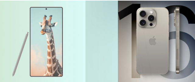
Galaxy S25 Ultra vs. iPhone 16 Pro Max: A Closer Look at Design and Features
As anticipation builds for the release of the iPhone 16 Pro Max, tech enthusiasts are eagerly comparing it to upcoming competitors like the Galaxy S25 Ultra. While both smartphones are expected to offer similar screen sizes and dimensions, the Galaxy S25 Ultra stands out with its cleaner front design, free from the iPhone’s Dynamic Island feature. This article explores the key design differences and what makes the S25 Ultra’s front appearance more streamlined.
Comparing Screen Sizes and Dimensions
The iPhone 16 Pro Max and Galaxy S25 Ultra are set to compete closely in terms of screen size and overall dimensions. Both devices are anticipated to feature large displays with similar lengths, widths, and heights, catering to users who favor expansive screens for immersive experiences.
Key Similarities:
- Screen Size: Both smartphones are expected to offer large, high-resolution displays.
- Dimensions: The length, width, and height of the iPhone 16 Pro Max and Galaxy S25 Ultra will be nearly identical, ensuring a comparable user experience in terms of screen real estate.
The Impact of Dynamic Island on Design
One of the major design differences between the iPhone 16 Pro Max and the Galaxy S25 Ultra lies in the front-facing features. The iPhone 16 Pro Max will likely include Apple’s Dynamic Island—a design element that houses the front camera and sensors in a pill-shaped cutout. While this feature aims to enhance interactivity, it also affects the overall aesthetics of the device.
Dynamic Island Considerations:
- Visual Disruption: The Dynamic Island can be seen as a visual distraction, impacting the seamlessness of the front display.
- Functionality: While it offers new interactive features, some users may prefer a more traditional design without such interruptions.
In contrast, the Galaxy S25 Ultra is expected to forgo the Dynamic Island, resulting in a cleaner, more uninterrupted front display. This design choice emphasizes a more traditional, sleek appearance, aligning with the Ultra branding’s promise of high-end aesthetics.
Why the Galaxy S25 Ultra’s Design Stands Out
The absence of the Dynamic Island on the Galaxy S25 Ultra contributes to a more streamlined and minimalist front design. Here’s why this matters:
- Enhanced Screen Aesthetics: Without the Dynamic Island, the S25 Ultra’s display will feature a more continuous and unobstructed viewing experience.
- Premium Look: The cleaner design aligns with the Ultra series’ emphasis on high-end, sophisticated aesthetics.
Conclusion
As we await the release of the iPhone 16 Pro Max, it’s clear that the Galaxy S25 Ultra offers a compelling alternative with its focus on a more seamless front design. Both devices will share similar screen sizes and dimensions, but the S25 Ultra’s choice to omit the Dynamic Island could give it an edge in terms of visual appeal. For users who prioritize a clean and uninterrupted display, the Galaxy S25 Ultra promises to deliver a front appearance that truly lives up to its Ultra name.
Key Takeaways:
- Design Comparison: The iPhone 16 Pro Max and Galaxy S25 Ultra will have similar screen sizes and dimensions.
- Dynamic Island Impact: The iPhone 16 Pro Max includes the Dynamic Island, which affects its front design.
- S25 Ultra Advantage: The Galaxy S25 Ultra offers a cleaner front display by omitting the Dynamic Island, enhancing its aesthetic appeal.
Stay tuned for more updates as these flagship devices near their release, and consider how their design choices might influence your next smartphone purchase.
